


The plot thickens
New COVID variant horizon scanning idea

At this late stage in the pandemic, it’s likely that the last thing anyone really needs is yet another kind of COVID chart. But I was thinking about how to visualise the spread of variants and how to pick out any potential new threats, and so here’s an idea. The short version of this post is that everything seems fine, by the way, but I just wanted to give a picture that illustrates this.
We know that the level of imminent threat from a variant depends on two things: firstly its market share (current percentage of genomes) and secondly its growth rate. Both these things matter, and they matter together: for example, a variant that is doubling every week but only represents 1% of the sequenced genomes is unlikely to cause growth right now (because it can only influence the overall observed R number by 1%).
Of course, if this growth rate were sustained for a few weeks, then its share would grow, and we might start to have a problem. But if we knew the market share and growth rate exactly then we would be able to tell when this variant might have grown to a stage where it starts to cause trouble among the hospital numbers.
Arbitrarily, we might say that 50% market share is a level at which a variant has a significant effect on the overall growth rate. (There’s no real reason for this number, or any reason to think it’s better than 30% or 70%, but it is just for illustration), so we can work out how long it might take for a variant to hit those levels.
And here is the result of this: each point is a variant, with the estimates for market share and growth rate just read off from Dave’s page. Variants in the bottom left corner are no problem (low share, low growth rate), variants in the top right corner are a big problem (high share, high growth rate).
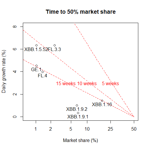
The sloping red lines are contours (and I hope I did the sums correctly to put them in the right place!). For example the fact that FL.3.3 is between the 5 and 10 week contour suggests that it might take between 5 and 10 weeks (and probably closer to 10) to reach the 50% market share.
But overall, it seems very encouraging. Not only are hospital numbers low and falling, but this quick and dirty horizon scan doesn’t reveal any current variants that are in the part of the graph where we might see a return to significant growth within the next 6 weeks or so. That’s good news!
There’s a caveat of course, which is that all these numbers are somewhat noisy. Current percentages and growth rates are estimated from small samples (only around 500 sequenced genomes per week). Hence there is an inevitable degree of uncertainty about the true values, and the true position of these points on the graph. But as a simple variant visualisation and horizon-scanning tool, I think it works quite nicely.