
Variant update
My weariness amazes me, I'm branded on my feet

A key thing I realised during the pandemic was that you didn’t need to drink from the firehose of data. While Governments were giving us more numbers than we’d ever had, the key was to find the right number and stick with it. By 19th September 2020, you could tell the UK was in trouble because of hospital admissions in the North West. At that stage you could even extrapolate the exponential growth and say “we hit previous peak at Hallowe'en at that rate” - and guess what day Lockdown 2 was announced?
Of course, those days of hospitals being overwhelmed are long behind us, but people are still trying to warn us about the spread of new COVID variants. So what is the key number here? It’s the growth rate of the variant - because we know that it implies the size of any resulting wave.
As Thomas House and I described here in Plus Magazine the growth rate is actually pretty easy to estimate. Just like the log scale axis trick that turns exponential curves into straight lines, you just need to plot the S-curve of percentage share of the variant on a so-called logistic scale. You expect the data to be on a straight line, and the slope of that line tells you the (relative) growth rate, as illustrated in our Plus article:
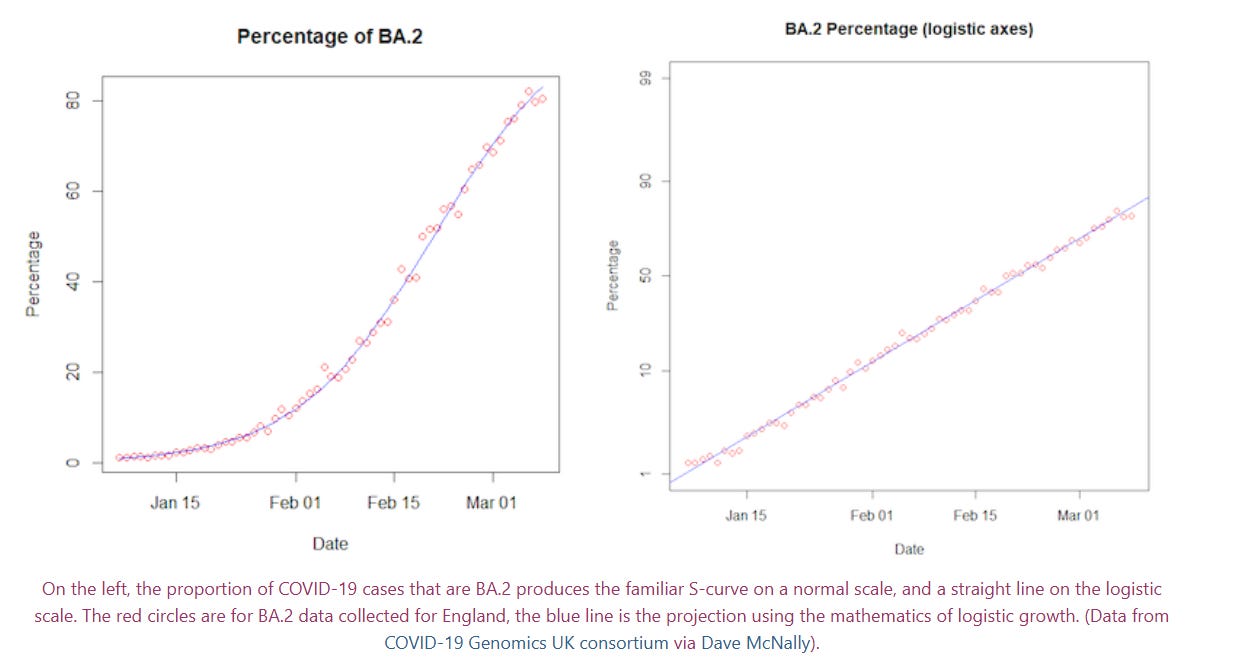
You can see how fast a variant like BA.2 came in at the start of 2022. It went from 1% to 10% and from 10% to 50% in a matter of two or three weeks. If I dig out my estimates of growth rate from the time, it looks as if it had about an 11% growth rate.
So, what’s the variant situation like now? You might remember that about three months ago I was sceptical of claims about the LP.8.1 variants, because the much-touted 60% share of sequenced genomes was literally based on 9 samples out of 15:

Well, it turns out that scepticism was justified. These LP variants are indeed the most common ones now, but now we have more data we know that they topped out a month or two later at somewhere around 40% market share, and the 60% figure was indeed nonsense. Further, you’d struggle to identify an effect of this variant on the curve of COVID hospitalizations, still running at rock bottom levels for the last 7 or 8 months.

But of course, variant hype never sleeps. Next we moved on to NB.1.8.1 (“Nimbus”, as some excitable people call it) of which we were told a couple of weeks ago “It’s quite possible we will see a large wave of infection here in two months or so once it becomes dominant”.

But none of these reports ever mention the growth rate. It’s the key piece of data, and it’s just missing. Perhaps we can’t expect journalists to estimate it, but scientists commentating on variants certainly should be able to. Thanks to a lovely new page created by Dave McNally which gives us access to all the variant data from all around the world, it’s not a hard calculation. If we do that, we can see the growth rate of NB.1.8.1 (blue) in the UK, and estimate it to be about 3.7%. It’s a lot slower than the BA.2 example above, and I think we can be pretty relaxed about that variant as a result.

In fact, you’ll notice something interesting. There’s another variant, XFG (red), which is growing faster. The estimate for the growth rate of that is 6.4%. Not as fast as BA.2, and so probably not big enough to cause a huge wave, but if any variant is going to take us off these low levels of hospitalizations then I think it’s going to be that one. We can confirm that by looking at Dave’s data worldwide (which brings in 20 times more samples) - the timing is a bit different, but the estimates of slope are very consistent.

But what does this tell us beyond the direct implications? What does it mean about the way these things are reported? Personally, I think it’s terrible for science communication if people keep bringing up new variants and then whipping them away like Lucy’s football. Of course if you keep predicting a wave will come soon then you’ll probably be right eventually.
But I think it has a damaging effect on public trust if the dialogue moves from “you need to worry about LP.1.8” to “you need to worry about NB.1.8.1” to “you need to worry about XFG” in the course of just three months. How can scientists expect the public to trust their risk assessment on something like bird flu or mpox if they are prepared to hype up COVID variants without doing the necessary due diligence on growth rates?
As long ago as April 2023 I was warning about the danger of hyping up the XBB.1.16.1 (“Arcturus”) variant (Remember that one? Me neither), and it’s depressing that nothing has changed. But three years on from BA.5 (with its 14% daily growth rate), the last variant to cause a serious wave of hospitalizations, it would be nice to think that I’m not going to have to write this same article again two, three or four years down the line.
Great post. You are so correct about the issue of public trust. Of how by now that most of the serious health journalists have identified who the Cassandras are, but there is always the tendency to sensationalism...
Very useful, thanks. Linearised graphical data was a godsend as the variants came through. Before vaccination we only had lockdown. Even after widespread vaccination, hospitalisation had too strong a relationship with death, depending on the rising variant. These days we think more about morbidity than death. And at least anecdotally in my daily contacts, the relationship between hospitalisation and morbidity is much less instructive. Oncoming 'waves' are still worth knowing about.