I’m still locked out of my Twitter account, and now don’t have much hope of getting access back, which annoyingly means I’m cut out of various arguments. But since I actually started one of these arguments, here are some thoughts on inter-year comparisons and the current state of COVID.
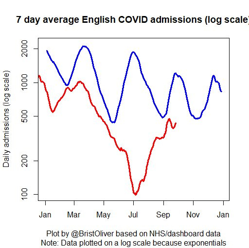
It all kicked off when I shared a graph with COVID Twitter legend James Ward. It shows that every day so far in 2023, UK COVID admissions have been lower than on the corresponding day in 2022. That’s great news (if not completely surprising - essentially the more times people are exposed to the virus, either through vaccination or infection, the less serious we might expect the consequences of each infection to be on average).
Unfortunately, some people didn’t seem very prepared to take this good news at face value. It seems to have become an established fact in certain circles that a change in COVID testing procedures at the start of April 2023 makes the recent hospital data worthless and that it cannot be compared with previous years. I personally don’t believe this at all. You can see a very small kink in the red line at the point where procedures changed, but it’s not a huge effect - it’s not like numbers suddenly halved. In fact, I estimate it made perhaps a 10% difference to the figures, but that the numbers are broadly comparable either side of the change - the change came at a time of exponential decay, and the trends are extremely comparable either side of the line, with the red line just showing a small offset downwards.
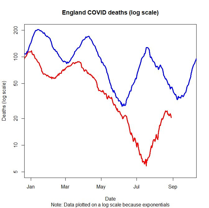
But we don’t have to take that on trust, we have other measures! For example, here are COVID deaths as recorded on death certificates: again 2023 is uniformly better than 2022. (And bear in mind that lying on a death certificate is a pretty serious matter)
Someone else demanded that we look at primary beds occupied (these are “for COVID” not “with COVID” - this definition is unaffected by the April 2023 change, which involved not routinely testing people without respiratory symptoms). The same thing is true!
In fact all these three pictures tell us the same story (note that the final one is on a linear scale not a log scale): so far every day of 2023 has been better than the corresponding day in 2022 for COVID in the UK. The same wouldn’t quite be true of comparisons with 2020 and 2021, when very low figures were achieved in the summer - but it’s worth remembering that this was only managed at the cost of hugely disruptive lockdowns, with costs including school closures, loneliness and economic damage.
But by any reasonable measure, 2022 was better overall than the previous years. For example, look at deaths. The ONS tells us that
Coronavirus (COVID-19) was the sixth leading cause of death in 2022 (22,454 deaths, 3.9% of all deaths registered), having been the leading cause of death in 2021 (67,350 deaths, 11.5% of all deaths registered).
A new disease arrived, it became the leading cause of death for a while, then people were vaccinated and the severity dropped. Furthermore, COVID is likely to drop further down this ranking in 2023, as my death graph above indicates. The dashboard shows that by the end of August there had been 10,977 COVID deaths in 2023, which is less than half the figure of 24,467 for the corresponding period in 2022, which in turn was less than half the 56,772 deaths recorded in the first eight months of 2021. Things are so much better than they used to be!
But some people aren’t happy at this either - another objection is “what about the excess deaths”? Perhaps Long COVID (diagnosed or not) is causing long-term complications and health problems that aren’t showing up directly in the COVID death numbers? Well, the curious thing is that now perhaps there aren’t any excess deaths that can’t be explained by COVID numbers. Some fascinating recent detective work by
and Jean Fisch has been showing that much of the apparent excess death effect can be explained by looking at deaths by date of occurrence, not date of reporting (as surely we should). In fact, there’s a strong argument that on this basis we haven’t seen any excess deaths in 2023 at all.Then yet another argument comes in, based on test positivity: we are told that this is the highest it’s been for 18 months. But this argument is coming precisely from the people who told us that we couldn’t make comparisons with before April 2023 because testing criteria have changed! And of course they have: a large proportion of all testing now takes place in hospitals, and a large proportion of that is directed at people who are likely to have COVID - obviously positivity is high!
In fact, by stopping spending time and money doing routine testing on a large number of people who are unlikely to have COVID, we know exactly what we’d expect: the total number of cases detected wouldn’t go down much (my 10% above), but the positivity would go up a lot. I can illustrate this here with some toy numbers (these are not meant to be representative in any sense, but just meant to show how this effect can arise).
In the first scenario, testing high and low positivity people together has a relatively low overall positivity of 4.8% and catches 24 people. Moving to only testing the “likely COVID” people sees positivity go up a lot, and the number of positive tests not drop by much: exactly what we have seen in real data.
Overall though, I’ve got to say that I find this whole state of affairs pretty frustrating. I don’t have any time at all for people who argue that 2020 and 2021 weren’t bad. I’m particularly frustrated by people who try to retcon the situation by arguing that our ability to get through 2023 without lockdowns and NPIs means that we could have done the same in 2020 when population immunity was so much lower. But equally, I find it difficult to respect people who are still arguing as if things aren’t much vastly better now than they used to be.
In fact, the language around this gets pretty ugly. It’s hard to point out positive data without being called a minimizer, being accused of eugenics, or worse. I’m not the only one feeling this way, either: when incredibly sensible, evidence-based and COVID-conscious people like
are also getting attacked for being a minimizer, you have to question how far the pendulum has swung in certain quarters.Honestly, I’ve never been afraid to call things out when it was bad. Since I am talking about inter-year comparisons, today is 1st October, and here are a couple of snippets from the same day three years ago. On 1st October 2020, I published a piece for the Spectator about the disturbing hospital trends in the North West:
On 26 August, the number of hospitalised Covid patients in the region reached a low of 77. Five weeks later, this number has grown to 612 – an eightfold increase. While this is much lower than the 2,890 reached on 13 April, another eightfold increase would see it far exceed that first-wave peak. The arithmetic of epidemic growth means that such a further increase, perhaps over a similar timescale, cannot be ruled out – and could even be regarded as the expected outcome.
Perhaps it seems obvious now, but I can assure you that at the time this was far from the received wisdom. There were plenty of people (and not just a fringe few) arguing that things were different this time, that growth would slow down and so on, whereas my warnings that the first-wave peak could be exceeded (and even the timescale on which it might happen) aged extremely well.
On the same day, 1st October 2020, I wasn’t happy with the reporting of the change in estimated R number coming from the REACT study. In fact, this was one of the more surreal moments of the entire pandemic for me, when slightly intemperate comments from my Twitter account ended up on the BBC website within an hour or so. Again, I was convinced that the reported slowdown (from estimates of R=1.7 to R=1.1) was more a result of curve fitting and statistical analysis than capturing anything genuine about the pandemic. In fact, it’s kind of ironic that one of the people complaining about my 2022-2023 admissions comparison was much more optimistic than me about this REACT issue!
And again, my nervousness turned out to be right. There wasn’t much of a genuine slowdown, and so a month later we slid into Lockdown 2. Indeed it’s worth remembering that three years ago today we had almost no evidence that the cavalry was about to arrive in the form of vaccine efficiency data, and if that state of affairs had persisted then the situation would have been almost intolerably bleak, as alpha and delta had spread among a population still with a very low level of immunity among the vulnerable.
Like I say, I’ve never been afraid to call out when I believe things are bad, but I think that by any reasonable comparisons we have to acknowledge that things aren’t like they were. 2023 isn’t as bad as 2022, which was nothing like as bad as 2021 or 2020. Of course, we still have the winter to get through, and while BA.2.86 has been growing slowly so far, there’s a likelihood it will pick up further mutations which will cause it to accelerate. But coming up on four years since this thing first emerged, it’s important that we remember that the situation is nothing like it used to be, and that it shouldn’t require any skullduggery with the data to convince yourself of that.
Since I remain locked out of Twitter, I don’t have easy ways to get this post and others out there. So, if you found it interesting, please share it on social media or elsewhere, and please pass on the message that my Substack exists and posts will always be sent out free to subscribers.


I find it very interesting that there are those like yourself, that correctly test the hypothesis against the facts and then reject the hypothesis if the facts don't fit, whilst astonishingly there are others, many with a scientific education who simply try to reject or ignore the facts that don't fit with their preferred hypothesis. I see that as a significant failure in scientific education.
(I do accept that sometimes it is the facts that need refining as in the example where deaths plotted by date of reporting leads to a very different interpretation to deaths plotted by date of occurrence.)
I appreciate the update. I’m immune suppressed. I’d still long for a vaccine that stopped transmission.