


Christmas chocolates, plus UK COVID data, week starting 5th December 2022
Sweet, Caroline?

This week I wrote something about how maths can help you Numbercrunch your Christmas. It was fun to do - my book aims to help people understand how mathematical and statistical ideas can make sense of stories in the news and of everyday situations (not just COVID!), and it was a nice challenge to apply that principle here. Obviously the various 200-300 word vignettes leave out as much as they say, but the quasi-randomness and the Markov chains are something I talk about a lot more in the book. It was also fun to try to condense it all even further into some 30-60 second videos that the University could share to get people in the festive mood (hopefully more to come in the next few weeks!).
One example I talked about there was the tricky situation where people return the nasty chocolates to the Christmas selection box. Here are a couple of bonus plots that I shared on my Twitter Circle but which didn’t make the final cut of the article. Suppose the box starts off with 24 nice chocolates and 6 nasty ones, and people put the nasty ones back and grab another one a proportion p of the time. Here is the probability that the last remaining chocolate is nasty - with a backsliding rate of 50%, the chance of being stuck with a nasty one trebles!

And in this situation, where the nasty chocolates get put back with probability 1/2 each time they are drawn, here are the trajectories that you follow “on average”. These are a bit like the COVID phase plots: each point represents the number of nice and nasty chocolates in the box at any given time, and the line points where you tend to go next. So you can see that the line tends to be more horizontal than you’d like, meaning the nice chocolates are being removed faster than the nasty ones.

Anyway, COVID. Last week I showed how the graphs were showing a return to growth. But on Sunday I also did a Twitter thread about how and why I don’t think this situation is anything like the last two Decembers (it’s not just growth, it’s the rate of growth that matters). So, it’s worth bearing that in mind when looking at the following graphs - even though we continue to see concerning stories regarding the pressure the NHS is under. It’s worth remembering that based on past omicron waves adding in say 1,500 to 2,000 daily COVID admissions into the mix can create significant pressure (even if it feels well off the record value of 4,134 we saw in the dire days of January 2021).
(8.50am 8/12/22) I’m always in two minds about how seriously to take it, because I think there are some sampling issues particularly at the local level which are hard to fix, but for what it’s worth ZOE incidence is up quite a lot in the last few days (it was 154k three days ago, and now 174k this morning). (Note some caveats about these numbers raised in the comments below)
But in terms of the newly released hospital data, I think the headline is that it’s up, but not up too much. The seven day average is up to 588 admissions/day, from a recent low of 474. So, like I say in the Twitter thread above, growth, but nothing like the two previous Decembers.

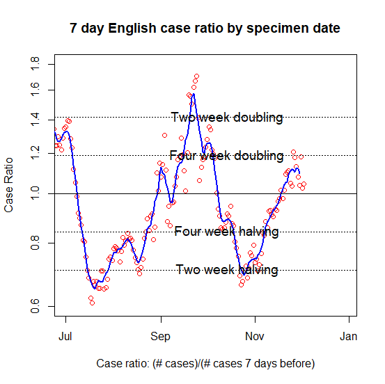
You can see from the admissions ratio plot that the rate of growth in the recent data d isn’t as much as those last two days at the end of last week, and admissions are currently taking more than four weeks to double. So, not ideal, but could definitely be much worse. Will definitely be interesting to see where the blue line goes next, I think.

(5pm 8/12/22) There is a similar picture of “growth, but not fast growth” in the latest dashboard case data as well. Again, doubling is taking more than four weeks based on the newest figures.
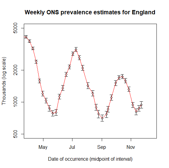
(12.15pm, 9/12/22) Just to complete the sense of slow increases all round, here is the latest ONS Infection Survey data as well - again showing that we were well into increases by the end of November, but not at as fast a rate as in previous variant-driven waves.
Comments about that ZOE (UK): Take care with today's figure. The historical revision was larger than usual (upwards). In the revised time series, the value 3 days ago was 160k, not 155k. Hypothetically, if someone was graphing day-to-day growth rate "by publish date", it may be safer to ignore the latest red cross: https://drive.google.com/file/d/1OkfOmcOqmWwplq3mvMVOxL9PlFEZ1VEN/view
Graphing ZOE against ONS (England), log scale: https://drive.google.com/file/d/1elR1BlpDbQs844qjUm4JB-vhDvSlqPZw/view
Graphing ZOE *growth rate* against ONS (England): https://drive.google.com/file/d/1U86_xBpc8dnvW6uiJZReKWNsKKPx_hjv/view
Data source: https://sourcejedi.github.io/2022/01/31/zoe-covid-study.html