Logging The World uses maths to make sense of the world. Today I’d like to answer the Big Question: “why are financial graphs so wiggly?”. Surprisingly perhaps, the answer is “because square roots don’t behave like you might think they should”. Let me explain.
The last few weeks of tariff madness have been another golden age for graphs. Not since the heady days of March 2020 have so many of us been transfixed by so many plots. But unlike the COVID graphs, which weren’t badly behaved if you plotted them the right way1, financial data is much wilder, even at the best of times.
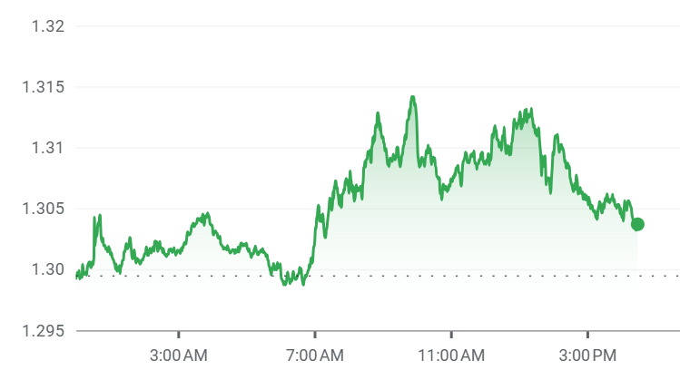
If I go to a site like Google Finance and pull up a graph of something like a day’s sterling-to-dollar exchange rate, you’ll see it never really stays still. It jolts up and down like a seismograph, always changing direction back and forth. It doesn’t feel like our usual maths vocabulary of straight lines and simple curves can tells us anything about this kind of behaviour.
But there’s something even more interesting. If I zoom out in time, and look at a century’s worth of the Dow (on a log scale), it has a lot of the same flavour. Sure, it drifts up roughly like a straight line over time, but we see exactly the same sort of wiggles and reversals (on a very different timescale) in a hundred year’s data as we did in a few hours’ worth. What is going on?
First, I need to talk about square roots. Not the most interesting function perhaps, but they seem like safe ground. 8 squared is 64, so the square root of 64 is 8. 80 squared is 6,400, so the square root of 6,400 is 80. It’s not a huge sample, but if you play around with a few more examples, you might soon convince yourself that the square root of a number is always smaller than the number itself.
WRONG! But wrong in an interesting way.
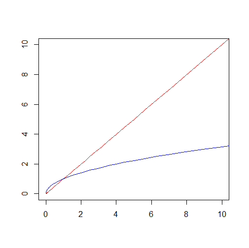
If we plot a graph of the square root function in blue, and compare it with the numbers themselves in red, we can see that the square roots are indeed generally smaller - at least until we look at values smaller than 1, and the curves cross over.
This makes sense once you think about it. 0.8 squared is 0.64, so the square root of 0.64 is 0.8 (it’s 1.25 times bigger!). 0.08 squared is 0.0064, so the square root of 0.0064 is 0.08 (it’s 12.5 times bigger). In fact, the smaller you go, the bigger the multiplicative gap. We can see by plotting the red and the blue graphs on log scales2 - they both become straight lines that get further apart the further left we go.
It’s exactly this divergence in how this blue square root function behaves which makes the financial graphs look so funky.
I talked recently about how Bachelier modelled financial returns using a normal distribution. I explained there that it probably wasn’t the best assumption, that real market quantities probably had heavier tails (were more susceptible to big fluctuations). But it’s not a terrible model, and it allows us to understand our graphs a lot more.
The key idea, introduced by Bachelier and lying at the heart of the Black-Scholes formula, is that stocks can be modelled in terms of a process called Brownian motion. To be precise, if we take the log scale plot of something like the Dow example above and tilt it to get rid of the upwards drift, what is left should be (a multiple of) Brownian motion.
So, what is this mysterious process? It can actually be quite simple to describe - much of the hard work was done by Wiener in arguing that such a thing even exists. But here’s a plot of an example of this purely mathematical construction. I’ve simulated the random behaviour on a computer, but you can see it does a really good job of looking like the graphs of real financial data.
One way to create this process is to think of the kind of “drunkard’s walk” I wrote about in Numbercrunch. There we might think of a drunkard tossing a coin and stepping a metre right or left every minute. We can get to a Brownian motion by thinking of our drunkard taking smaller and smaller steps at shorter and shorter time intervals.
The key property is that the process has no memory of the past. When it reaches a particular point, if you want to know where it will be t time instants into the future, none of the history matters. All that matters is that the amount it has moved by in this time has a standard deviation equal to the square root of t.
For people not familiar with the standard deviation, it’s like the margin of error in the random samples I wrote about a couple of weeks ago. It gives us an idea of where to find the track in the future - it should very likely be within a range of two standard deviations.
We can contrast that with the COVID data I mentioned before. Here’s the data from September 2020. By knowing where the red points (real reported cases) were, we could draw a line to predict where the black points would be in future. If we’d got the line wrong, and drawn something with the wrong slope, it wouldn’t matter for a while. Over a short time frame things wouldn’t go too far wrong, but far out into the future our prediction would become much less good.
Whereas for the Brownian motion, the opposite is true. Far out into the future, the square root standard deviation is much smaller than the uncertainty that you’d see from a mis-specified linear function. The process doesn’t tend to get too far away. But over a short time scale, the square root uncertainty is much bigger than the linear function. And the shorter the time interval, the bigger that relative effect is.
And that’s why financial graphs are wiggly. If we believe the Brownian motion approximation at least, over a very short time scale, there is a relatively large amount of uncertainty. That’s why the plots behave as they do.
Just to remind you, I don’t think it’s always the best approximation. As we’ve seen lately, the graphs can have even wilder swings, set off by statements from leading US economic thinkers like the Treasury Secretary or catturd on Twitter.
But just as understanding Newtonian mechanics is often good enough (even if the Einstein formulation is more accurate), these kinds of Brownian models are a good starting point. And it’s striking that Brownian motion has exactly the kind of “not changing in character when we zoom out over time” behaviour that we saw in the financial tracks. In that sense, it’s a lot like fractals like the Sierpinski triangle, with similar structure over a range of scales.
So in the end, in the spirit of George Box, these kinds of Brownian models are beautiful enough to be worth studying in their own right, even if they don’t always capture the full madness of the Trumpian movements. And it’s nice to think that on some level their quirkiness comes down to a fact about square roots.
On a log scale
You’ll notice that both axes are on log scales. Turns out you can’t have too much of a good thing.


The self-similarity of the plots you used reminded me of Peter's Fractal Market Hypothesis, but that is founded on some degree of actor rationality, not "the full madness of the Trumpian movement" as you put it.
Which suggests that there may be a line of enquiry -- beyond my meagre capabilities! -- to characterise divergences from self-similarity as an additional metric, presumably of "madness"?🤷🏼♂️